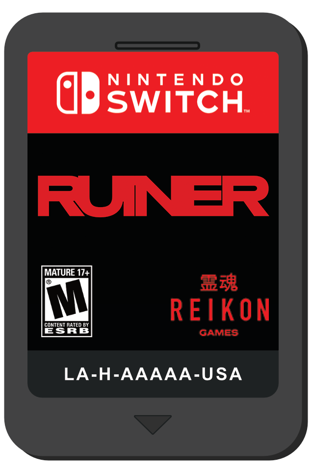

Mock up of the game cartridge which can be found inside the case.
The Nintendo Switch box is very slim and compared to the other video game consoles in the market just overall small in size. Ruiner doesn't have much marketing media outside of its own press kit on their website so I had to make due with the few images that I had on hand.
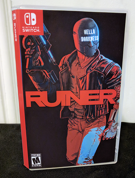
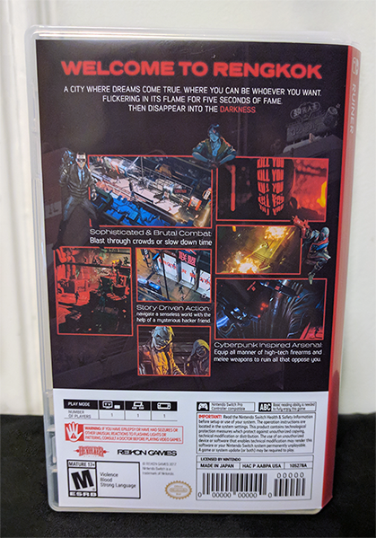
The restraints were, for the cover: Nintendo Switch logo/red square on the top left corner and the ESRB rating on the bottom-left. For the back cover the only constant was that it had to have a white rectangle on the bottom that held all the information and warnings that come standard for the Switch.


My thought process behind this project was to have it look as close to an official cover as possible. I looked at my other Switch covers to get an idea of what other manufacturers
went with for type and layout. As seen above, depending on the game it just varies wildly. I went with a balanced "average" of all the designs I saw.
went with for type and layout. As seen above, depending on the game it just varies wildly. I went with a balanced "average" of all the designs I saw.
-Spine font is sans-serif and in all caps, same font size as most other covers.
-Developer logo is on the back cover.
-Not too much detail on the back but a design that would catch the eye and give an idea to the story and game play.
-Developer logo is on the back cover.
-Not too much detail on the back but a design that would catch the eye and give an idea to the story and game play.
Overall I'm pleased with how it came out, even if the game never gets announced for the Switch this was a fun activity to spend time on as I waited for the release date on PC.